Swedish restaurant
Whether customers are enjoying a full meal, enjoying a snack or just chatting over a fika, the design of the restaurant seating areas plays an essential role in their experience. These areas need to meet a wide variety of customer needs, enhance the quality impression of the offer, create interest in the IKEA home furnishing range and build the IKEA Brand. In the Ljubljana restaurant different seating zones meet different customer needs and create a variety of atmospheres.
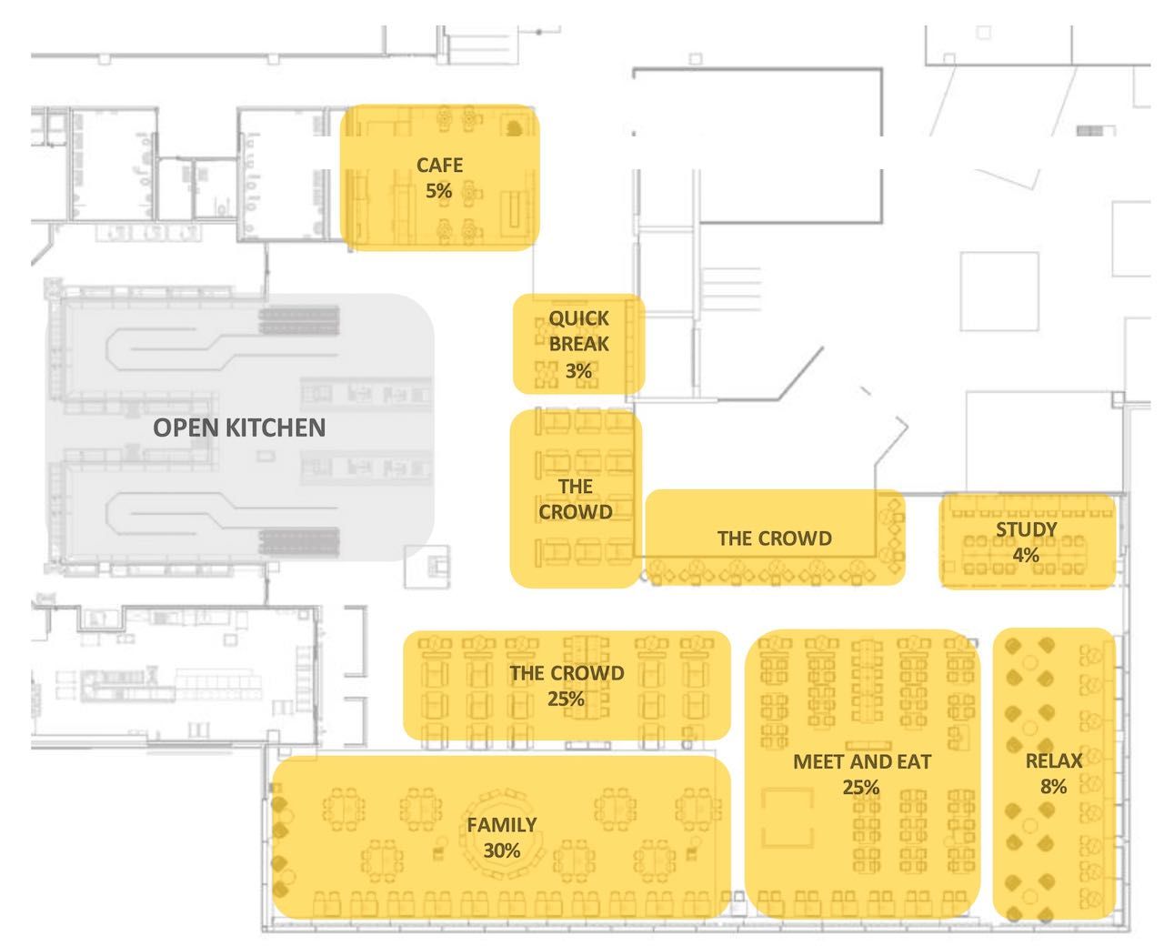
In Ljubljana, the general visual impression of the meet and eat, the crowd, the quick break and the work/study zones set a neutral Scandinavian base expression.
The areas relax and family create the peaks and tempo of the restaurant. Specifically in Ljubljana, a strong Café identity and area were developed. These three areas are placed strategically within the layout to draw customers into the back of the restaurant.
Overall the Swedish restaurant should have a strong home furnishing feeling. It should be a bold brand expression. The starting point of the Scandinavian modern style is a neutral base.
The café
The café is a clearly separate zone within the restaurant. With its own serving area and a close connection to the restaurant entrance, the café enhances a quick stay. Easy access to the café is important.
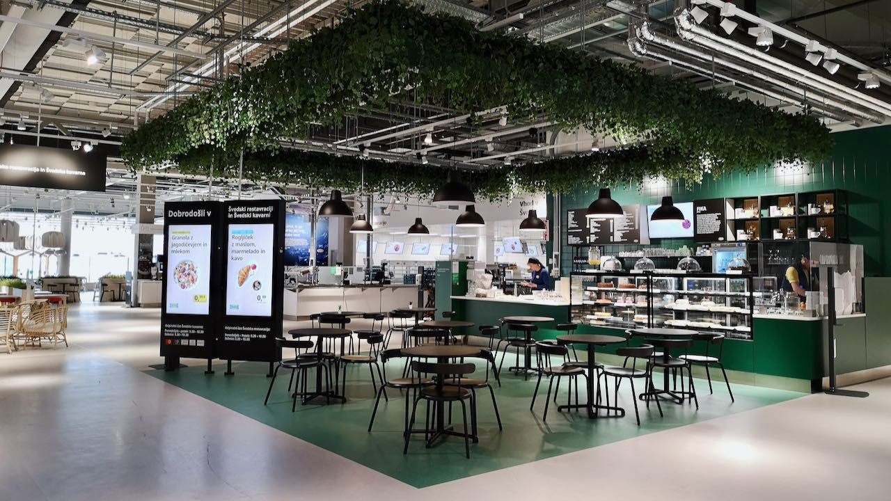
The area creates a visual peak in the restaurant area with a strong green and black colour scheme. Green terrazzo flooring enhances the separate zoning. These colours and the smaller tables create a simple, calm, cosy and contemporary Scandinavian atmosphere.
Quick break
Because this zone is closely connected to the entrance an the café serving line, it is ideal for a fast fika and a snack. The perfect place for meeting up with people.
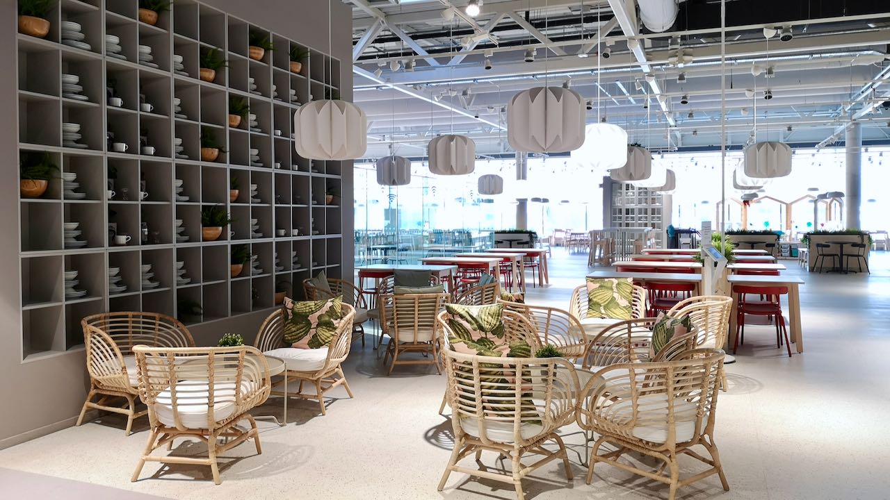
The simple, calm, cosy Scandinavian atmosphere connects with the adjacent seating zone: the crowd. Light furniture gives the area the flexibility of regrouping seating when needed. A floor-to-ceiling wall storage solution is accessorised, to bring Swedishness and seasonality in the area.
The crowd
This is a good area for people-watching with a nice overview over the restaurant and store entrance.
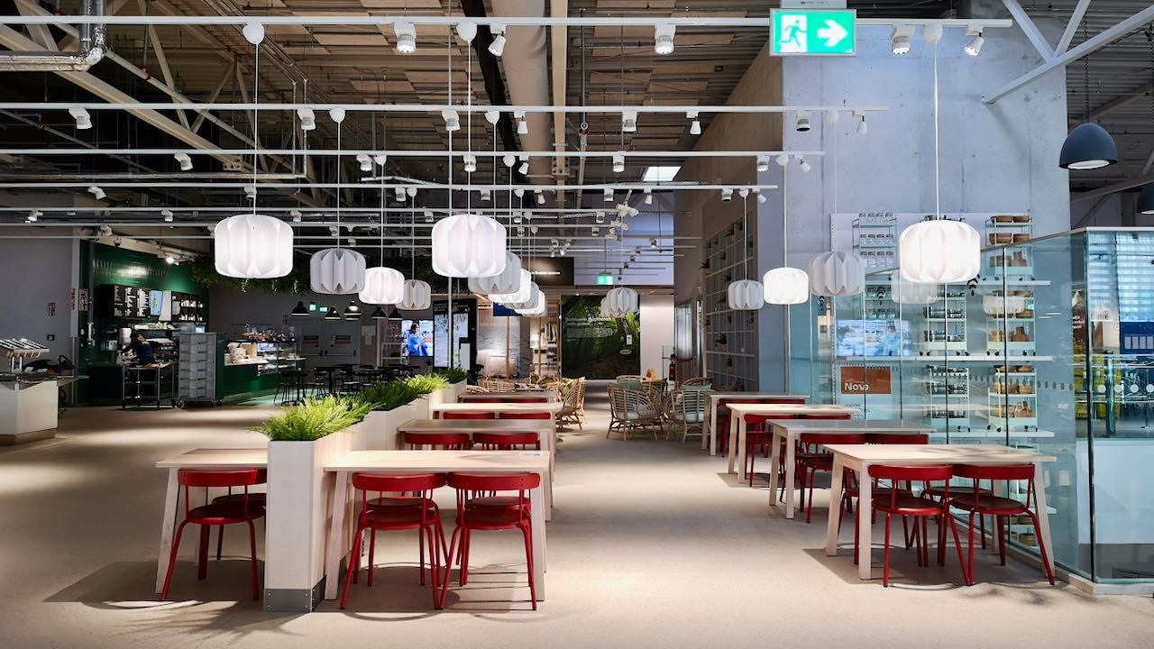
The crowd zone is inviting for customers who want a short, quick break. They can sit on their own or share bigger tables. It’s a high-density seating zone with big tables and benches, comfortable for a short stay.
Relax and study area
These parts located in the far end of the restaurant give visitors a cosy, rather quiet place to feel comfortable, relax and enjoy food and beverages.
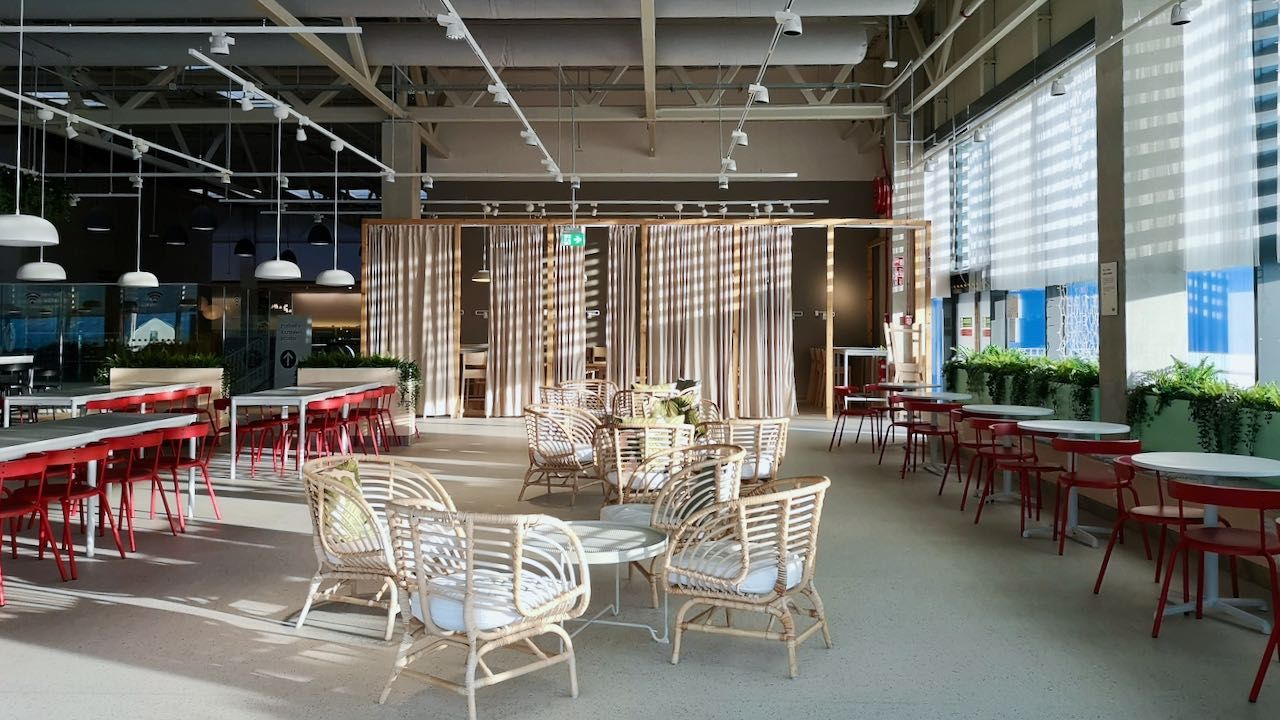
Partilly secluded with sound absorbing curtains, the work and study area invites customers plan their dream solution or just spend extra time in this quiet zone. There is space for laptops, plenty of outlets, good lighting and hooks for coats/bags. Everything needed for comfortable working. Natural materials and the use of plants and textiles enhance the relaxing atmosphere and help to reduce sound. In this calm area people can relax and recharge.
Meet and eat
This part of the seating area offers a relaxing atmosphere that invites people to spend time socialising over food and beverages.
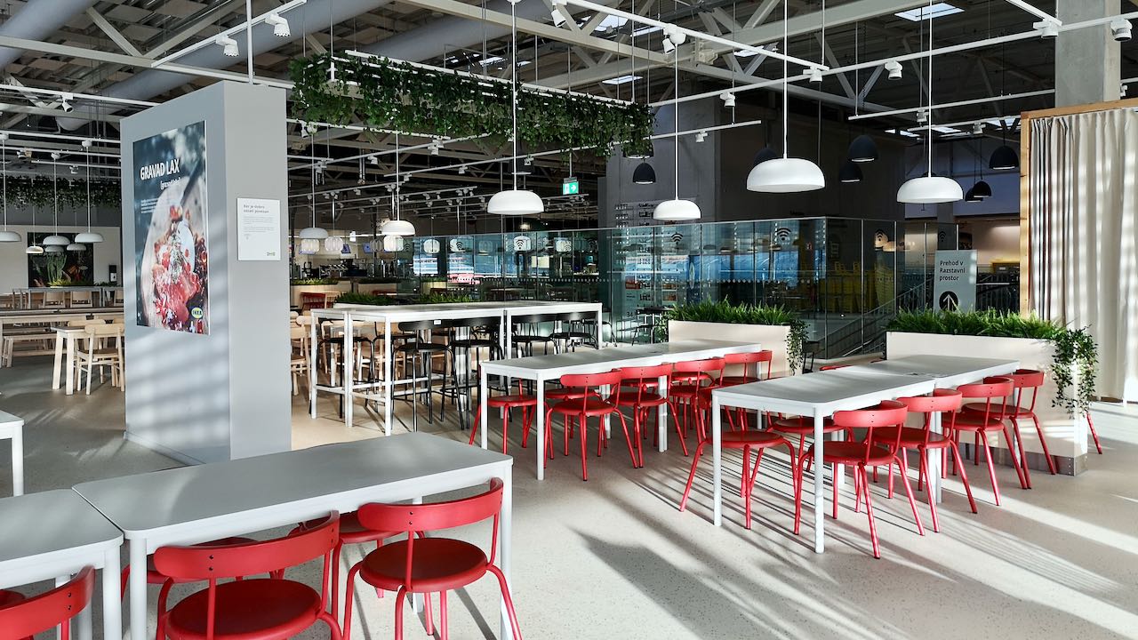
The structure here is kept simple with a variety of high and low tables. Two simple but inspiring storage solutions create a homely feeling. They are placed as room dividers and create smaler zones within the large seating area. The pendant ceiling structures with low hanging plants add texture and tempo.
Family area
The family zone sits on one side of the restaurant. It is easily accessible from the serving line and clearly visible from the entrance. This way, it can instantly attract children and parents. A light, colorful and playful atmosphere creates another visual peak in the restaurant area.
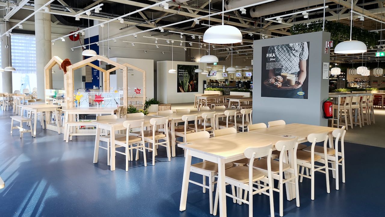
Larger tables make it easy to bring the family together. Seating for different ages is offered, from benches to high chairs. Cushions add personality and extra comfort on the benches along the windows. Larger aisles offer more space to move around with stollers, carts and give that extra room for kids to play after they have finished their meal. The play area sits in the middle of the family zone. A small kitchen unit serves as a kids food preparation area. The microwaves can be used to heat up food and milk and there are kids plates, bowls and cutlery to use for the little ones. Extra attention is put in the safety and functionality in this area. The blue vinyl flooring is designed to avoid slipping and is shock-reducing so it offers a softer landing. Sharp edges on furniture and finishes are kept to the minimum.
IKEA Ljubljana - Slovenia - 2020